Chippy Magazine
Branding and Illustration for startup
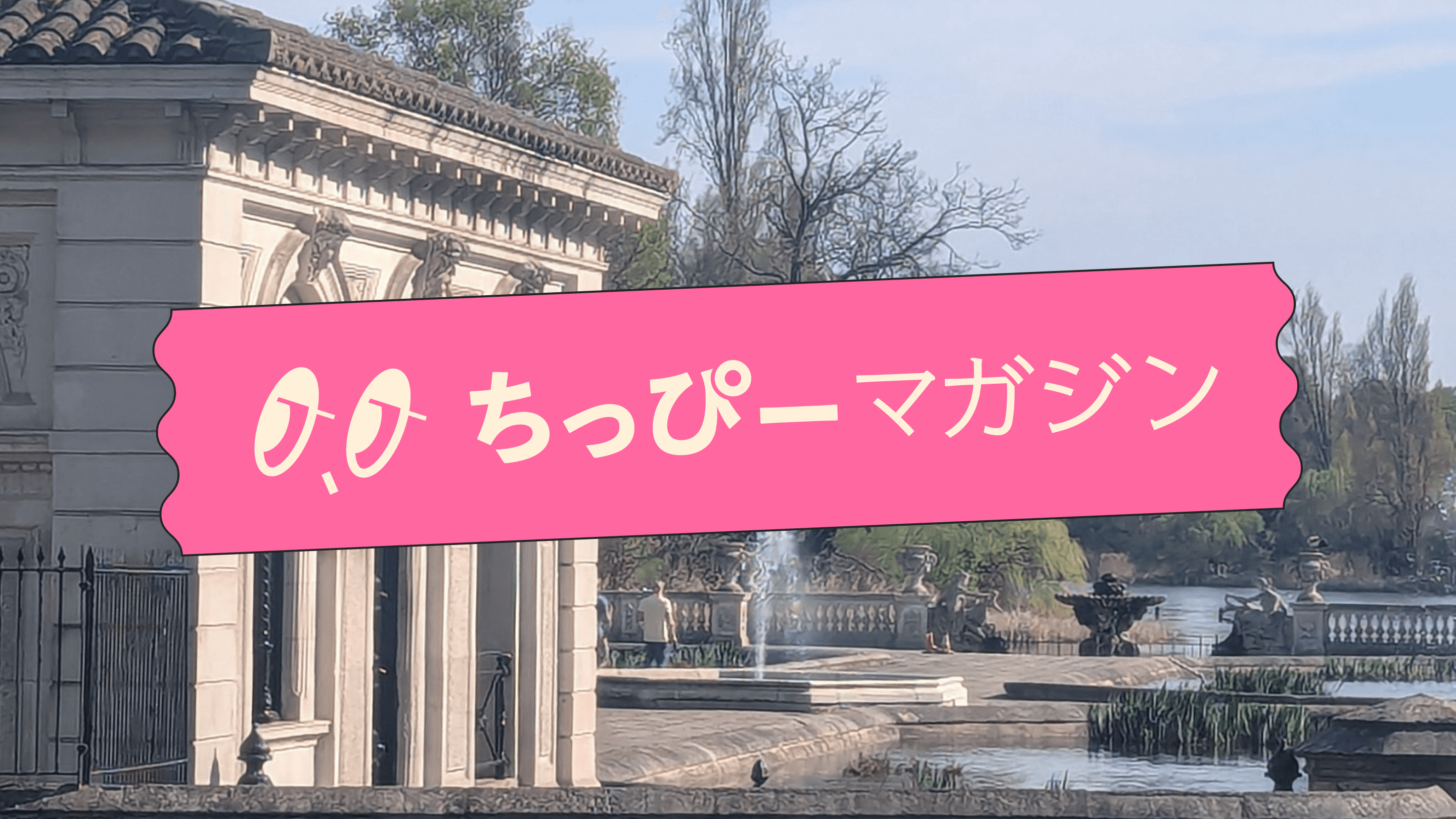
Chippy Magazine is a Japanese cultural web magazine centred on life in London. This magazine offers a grounded yet stylish look at everything from daily life hacks and money-saving tips to hidden dining spots, travel recs, and interviews with local creatives. To capture the energy and attitude of London, the visual direction leaned into bold colour blocking, artistic street photography.
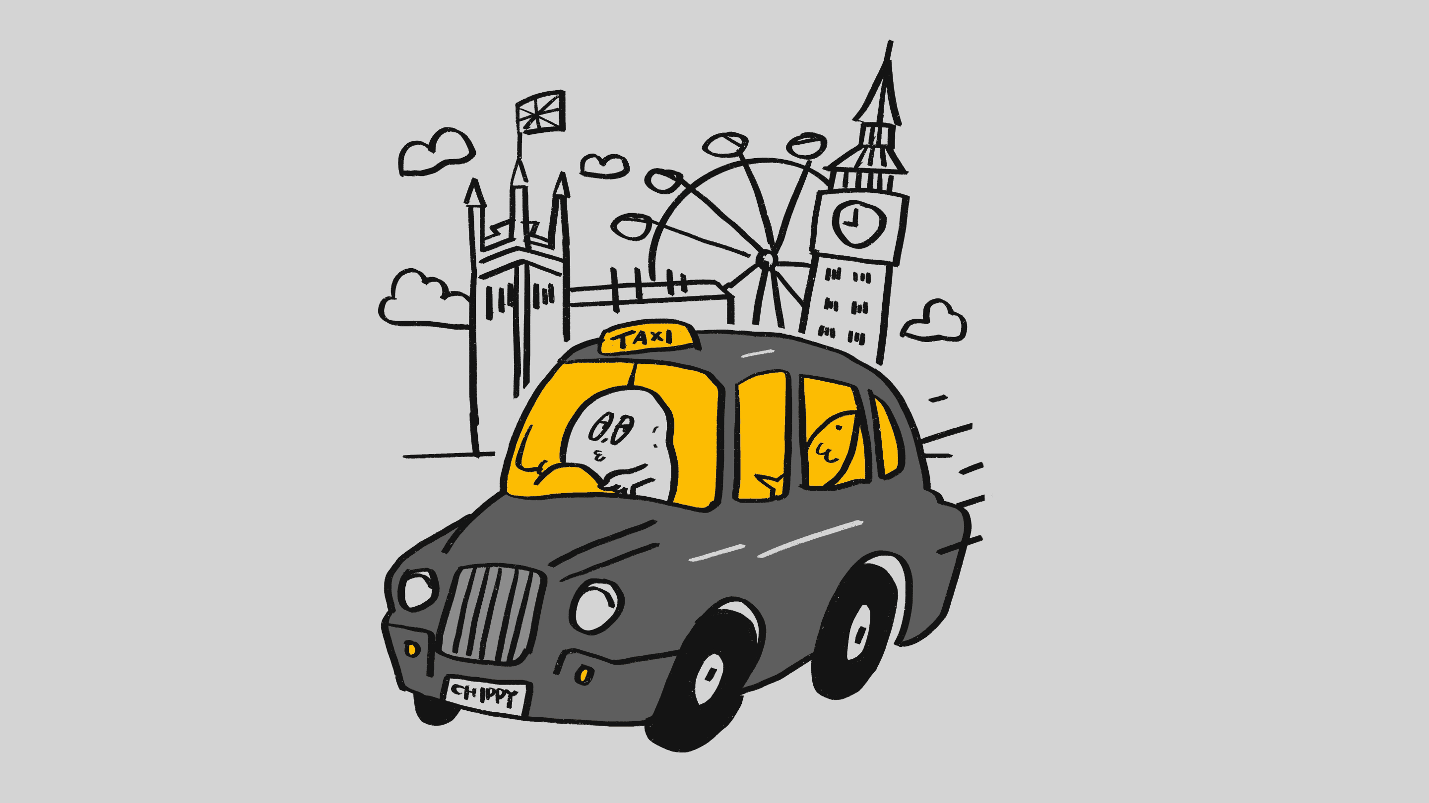
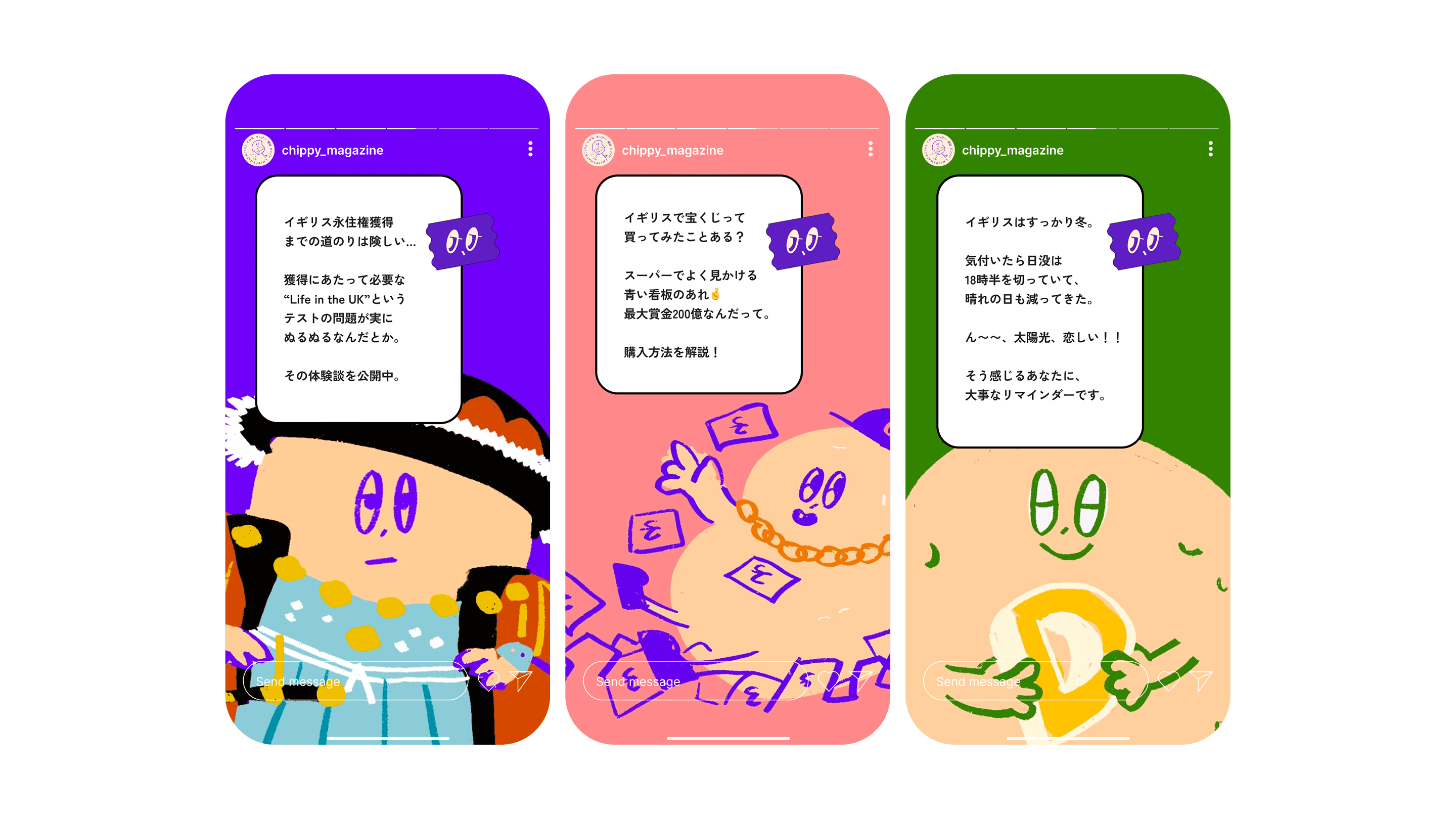
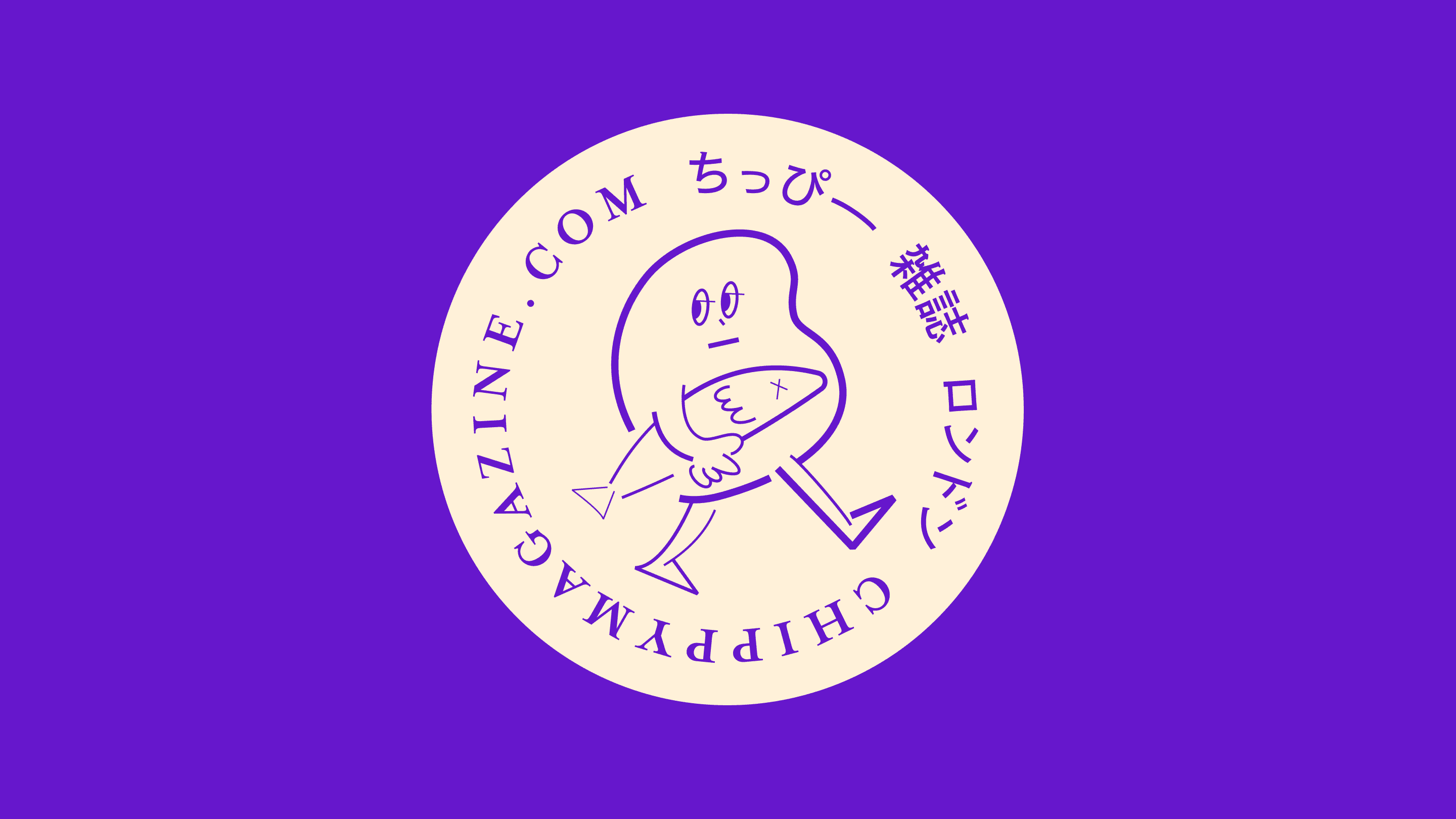
At the heart of the brand is Chippy, a potato character proudly holding a fish—an tribute to London’s classic fish & chips. This hand-drawn mascot appears across the site in various styles and formats—from illustrations to logo lockups—helping guide the reader and add a sense of charm and humor to the magazine.

Branding, art direction and illustration: Kaho Mukae